Packaging
Design
Cookware Brand 2024
Design
Cookware Brand 2024
Client: Navarasa Cookware | Agency: Double
Role: Design
Brief
To design a packaging system for Navarasa cookware that stands out on retail shelves while maintaining visual consistency across a large and diverse product range with varying categories and sizes.
Goal
To create a scalable packaging design that is clean, recognizable, and easy to organize, allowing customers to quickly identify products while ensuring consistency across the brand’s entire cookware portfolio.
Outcome
Developed a cohesive packaging system using pastel colour coding assigned to each product category, combined with a clear design structure. The result is a visually distinct, shelf-friendly packaging range that remains consistent, flexible, and easy to extend across multiple products.
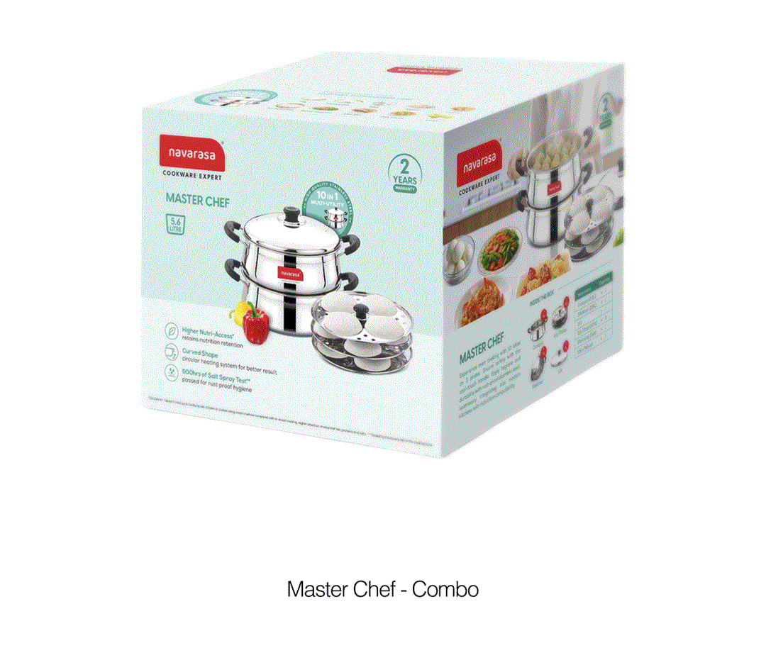
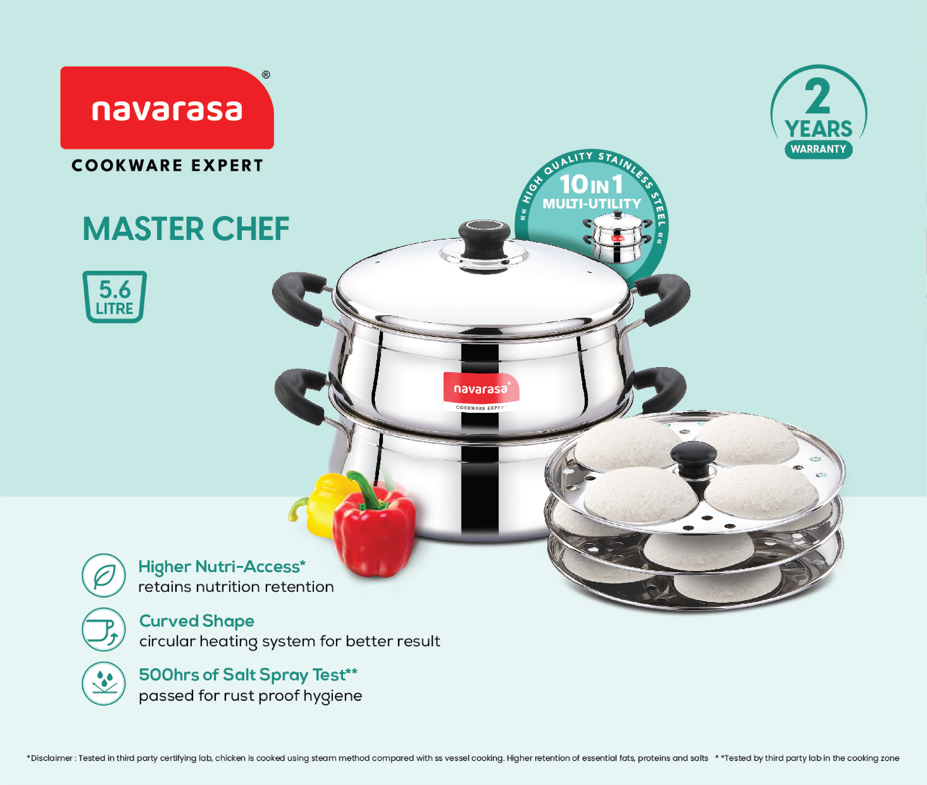
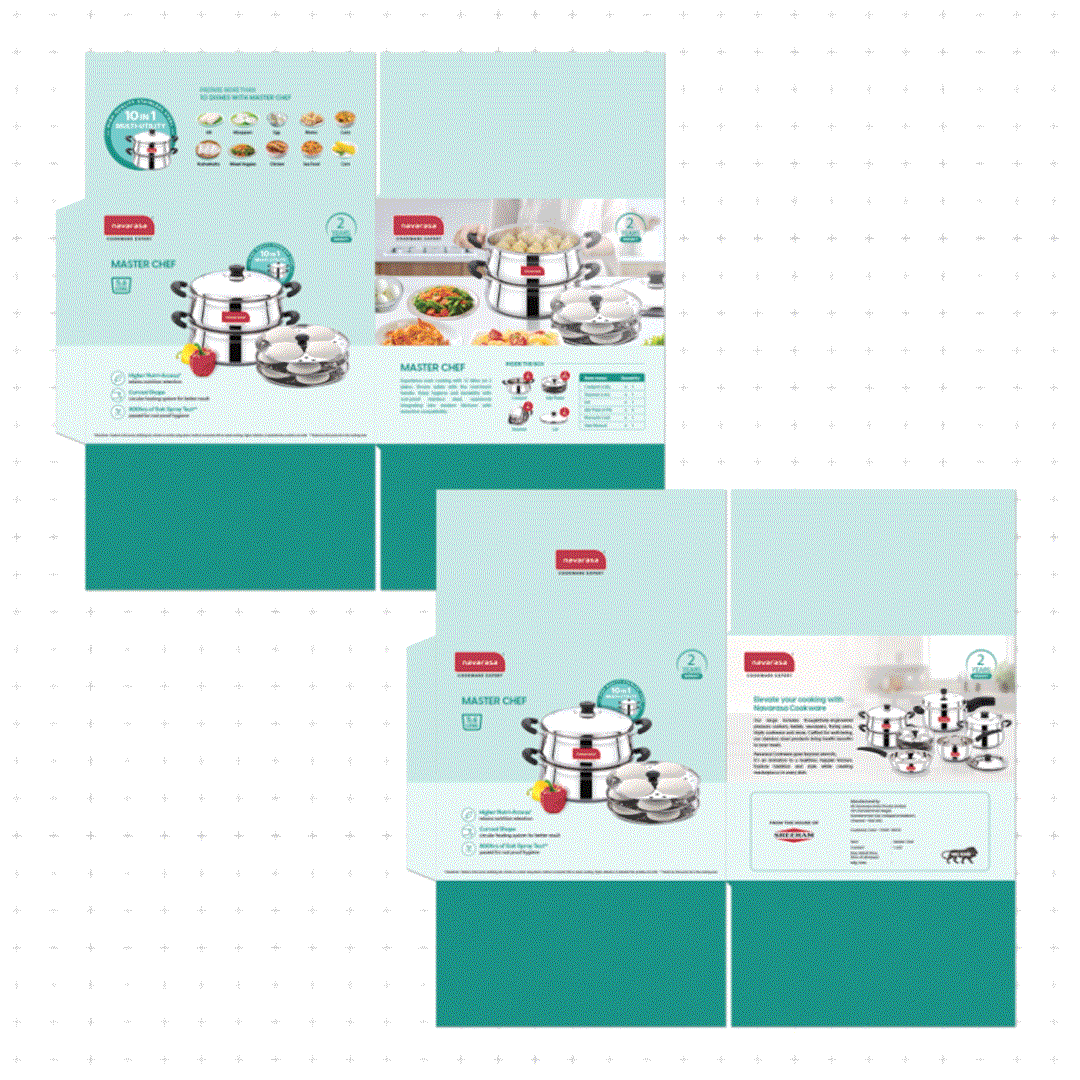
Front and Back Panels
- Primary Pack Design
- Primary Pack Design
Designed with a simple, direct visual approach featuring a hero product shot and category-specific vegetables. The front and back layouts were kept identical to improve shelf visibility and make product identification easy from any angle.
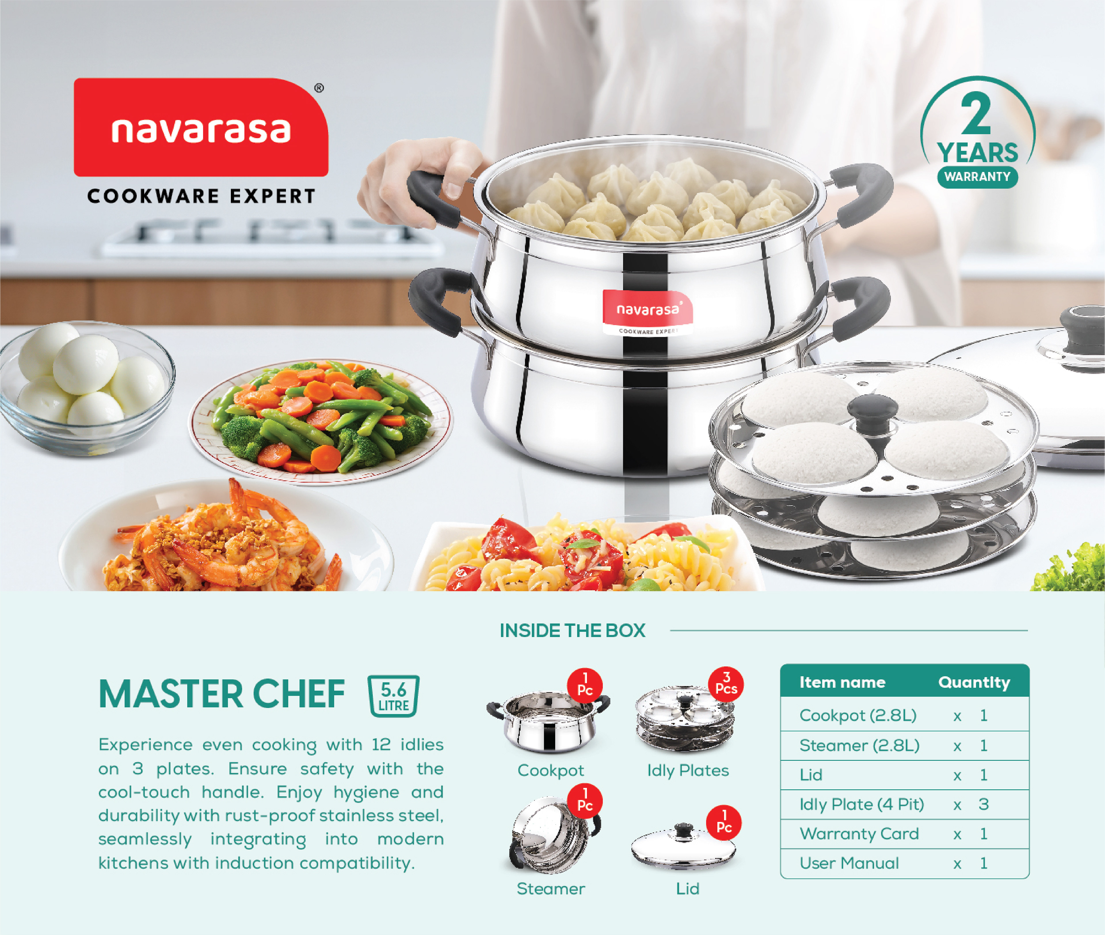
Side Panels
- Pricing and Lifestyle shots
- Pricing and Lifestyle shots
One side panel focuses on back-of-pack details such as pricing and product information, while the other features a lifestyle usage shot. Each lifestyle visual reflects real-world cooking scenarios using the respective cookware, with dishes prepared using the same product.
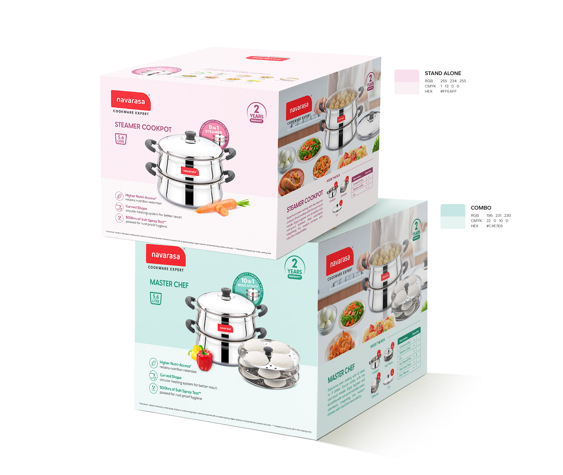
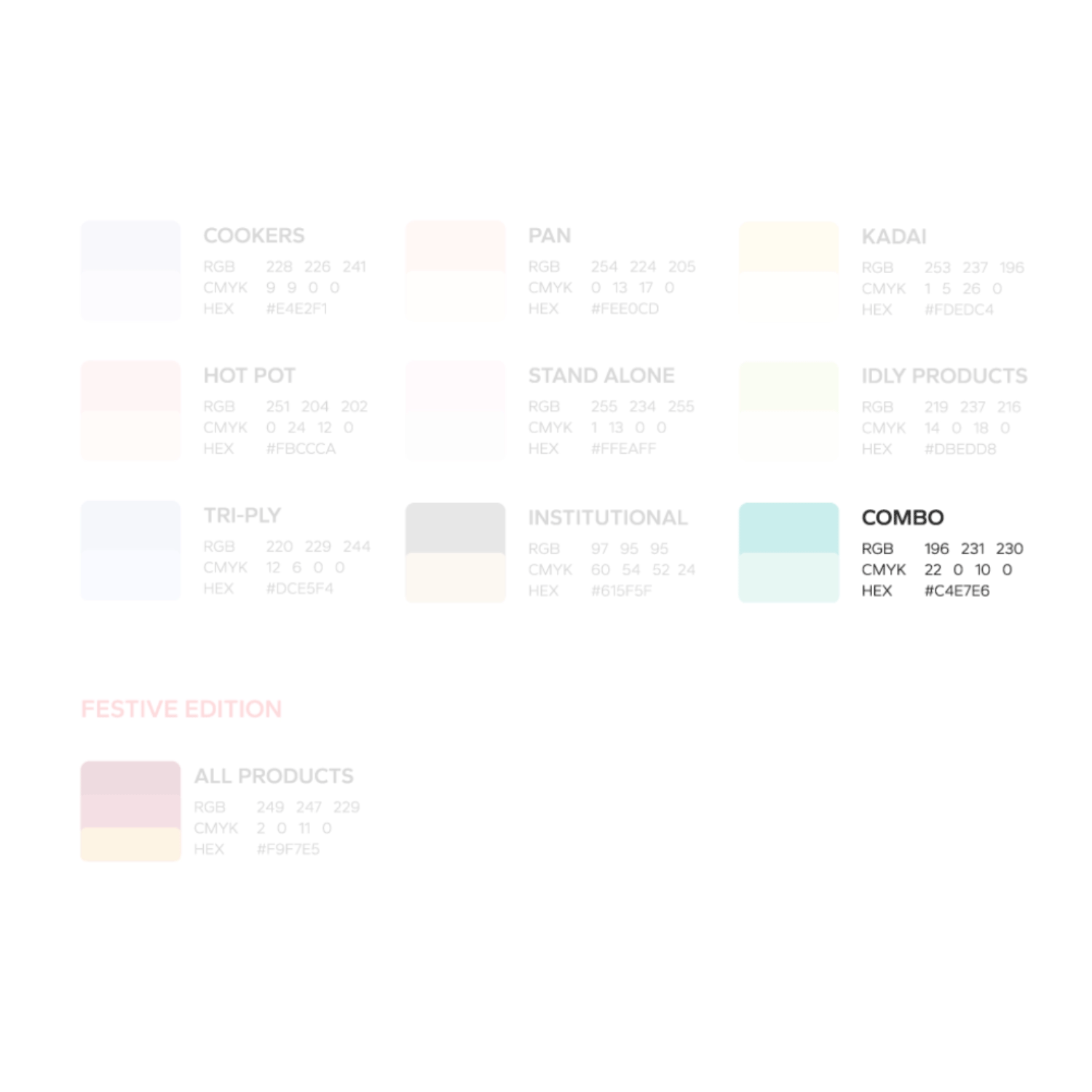
Colour Coding and Design Specs
A defined colour palette assigns a distinct pastel shade to each product category. Key line drawing(KLD) and design specifications were established to maintain a consistent visual language across the entire cookware range.
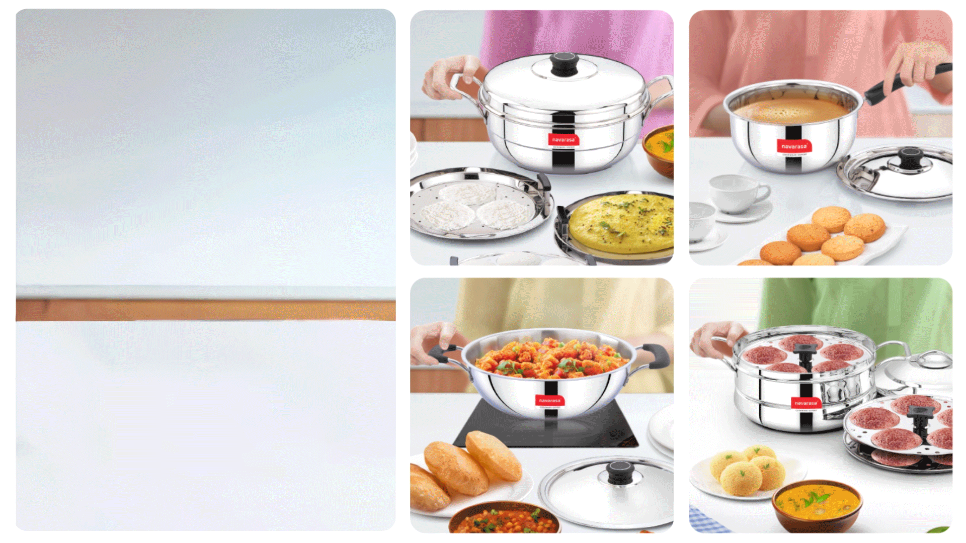
Lifestyle Visuals
A curated set of lifestyle visuals created through detailed photo manipulation, depicting everyday usage scenarios. Dedicated lifestyle imagery was developed for each product to enhance relatability and reinforce real-world application.
Packaging Mockups
A range of packaging mockups across multiple product categories.
A range of packaging mockups across multiple product categories.